† poetictragedy Posted May 6, 2013 Author Report Share Posted May 6, 2013 (edited) @PLGF: Wow, such an in-depth critique! I guess I didn't really consider the speed, and just arbitrarily chose some numbers. I thought it looked okay, but now that you mention it... I chose smaller intervals and re-uploaded it as my avatar, so hopefully that's a little better? @Verity: I'm not very familiar with the dodge and burn tools, so I don't mess with them much, but I suppose I should start, haha. I've heard that lighting trick before, but never could get it to look right. I'll give it another go next time though! Thanks for the comments, everybody~ Edited May 6, 2013 by poetictragedy Link to comment Share on other sites More sharing options...
Verity Posted May 6, 2013 Report Share Posted May 6, 2013 Well, dodge tool lightens what you click on, and burn darkens. Link to comment Share on other sites More sharing options...
† poetictragedy Posted May 6, 2013 Author Report Share Posted May 6, 2013 I know that much, haha. I just don't know how to effectively use them. Link to comment Share on other sites More sharing options...
Verity Posted May 6, 2013 Report Share Posted May 6, 2013 ahaha. Neither do I, but I manage to get lucky. Looking forward to seeing more of your stuff, keep it up! 1 Link to comment Share on other sites More sharing options...
Alice Posted May 7, 2013 Report Share Posted May 7, 2013 Yeah I don't realy know how to use most of the blends...most of mine it do to luck. The only ones I really am good at using is Overlay, Soft Light, and Hard Mix. The rest just happens when it happens. LOL! I always like your work Poe. Link to comment Share on other sites More sharing options...
† poetictragedy Posted September 20, 2013 Author Report Share Posted September 20, 2013 (edited) So I made a thing. Not completely happy with the animation, but I don't know how to do what I'm thinking and this was the best I could come up with. D: Edited September 20, 2013 by poetictragedy Link to comment Share on other sites More sharing options...
playlamegetfame Posted October 1, 2013 Report Share Posted October 1, 2013 How could i miss that... im sorry, this comes so late. rl keeps me busy... What did you tried to achieve? And why are frame 8 & 9 the same? Pay attention to the last part of the animation... It looks like there is a break. I would delete frame 9. Maybe thats the part youre not happy with.I also would increase the speed a tiny bit. Over all, it looks neat. I like it. Link to comment Share on other sites More sharing options...
xAaronx Posted December 29, 2013 Report Share Posted December 29, 2013 Gotta say poe you're really good, I love your current avatar, I might have to make a request from you for one sometime! I just love how she looks x3. I also see you've met one of my buddies on another forum (The Welsh Paddy) cause I recall the Deadpool Sig you did. Your Text and Effects are really spot on for most of these. Personally I like these the best. Love the pop out, you did her perfectly Loved the blur effects and background, it was a really nice blending. love the background and blending in this one, and I like how you did the bar & text for the sig looks very professionally done. Can't say much its pretty much perfect :3 Loved the border in this one I'ma have to steal this style for something sometime ;D! Just a tip for ones like this if you're using photoshop try to get a black lined border around the outside of the render if possible I forgot the name of the tool but it pretty much adds a border to the render at the bottom of the options in Render Options, you can tone down the opacity to help it blend or make it a solid line for comic effect. All in all you're a really good graphic artist aside from the one flaw in the spidey one your work's perfect :3 keep up the great work, I look forward to your new stuff in the future 1 Link to comment Share on other sites More sharing options...
† poetictragedy Posted January 11, 2014 Author Report Share Posted January 11, 2014 (edited) if you're using photoshop try to get a black lined border around the outside of the render if possible I forgot the name of the tool but it pretty much adds a border to the render at the bottom of the options in Render Options, you can tone down the opacity to help it blend or make it a solid line for comic effect.All in all you're a really good graphic artist aside from the one flaw in the spidey one your work's perfect :3 keep up the great work, I look forward to your new stuff in the future That's probably the stroke option. I use that all the time for borders, but I didn't think to use it on the render in this case. I'll have to try that next time. Ah, thanks so much~ I haven't made anything in a while, so I thought I'd try something completely different, haha. I played around with animation a little more. And tried another blinking avatar. I tried to follow PLGF's suggestions a little more. Edited January 11, 2014 by poetictragedy 2 Link to comment Share on other sites More sharing options...
Breathless Posted January 11, 2014 Report Share Posted January 11, 2014 (edited) They both look reaaaaally good! :x I'm jealous, I think you have a knack for animation.I like how you have a discrete popout effect on the ava too. Looks really neat. :3Is there any reason why your current avatar isn't blinking, but the one in your thread is? Just noticed your post in 'features' thread.But, again, reaaaally cool work! Edited January 11, 2014 by Breathless Link to comment Share on other sites More sharing options...
† poetictragedy Posted January 11, 2014 Author Report Share Posted January 11, 2014 (edited) Is there any reason why your current avatar isn't blinking, but the one in your thread is? Just noticed your post in 'features' thread. Yeah, the black and white avatar I had before was still working, but when I changed it, it wouldn't animate. Maybe somebody changed the rules. Loved the border in this one I'ma have to steal this style for something sometime ;D! I completely forgot about this border style! I made a second version of my Syo signature with it. :3 Edited January 11, 2014 by poetictragedy 1 Link to comment Share on other sites More sharing options...
Alice Posted January 12, 2014 Report Share Posted January 12, 2014 I completely forgot about this border style! I made a second version of my Syo signature with it. :3 I LOVE IT!!! You think you could make a Ichinose Tokiya one for me. : Link to comment Share on other sites More sharing options...
xAaronx Posted January 12, 2014 Report Share Posted January 12, 2014 I gotta say your new set looks great, it is a shame that the animation isn't working on your avatar for the forums. The sig looks great and the border looks grand I will be sure to request from you :3 Link to comment Share on other sites More sharing options...
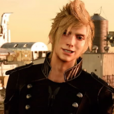
† poetictragedy Posted February 16, 2014 Author Report Share Posted February 16, 2014 (edited) Thanks, everybody~ New set. This is stupidly simple, but I like it anyway. Image taken directly from the Starfighter comic by HamletMachine. I may or may not be trying to grow my hair out like Cain's. X3 Edited February 16, 2014 by poetictragedy Link to comment Share on other sites More sharing options...
† poetictragedy Posted March 22, 2014 Author Report Share Posted March 22, 2014 UPDATE: Revamped original post... again. Instead of putting up every single signature, I'm just going to add my favorites to the OP. Aaaaand here's some stuff I've done recently: As always, constructive criticism is welcomed! Link to comment Share on other sites More sharing options...
lemmingllama Posted March 22, 2014 Report Share Posted March 22, 2014 Superb work as always. I do really need to get you to make me one of these at some point. Anyways, on to CnC. Momo and Nana - Looks great, nothing I would want to change.Second one (I dont recognize the character) - Render is a little blurry. One thing that you could do to relove this is to not use really clean text like the text in "I only ever...".Levi - Great banner. Only thing that bugged me was the layer with the diagonal bars, if the bars were faded slightly then I think the banner would look better. Either way, great work on these and I would love to see more. Link to comment Share on other sites More sharing options...
† poetictragedy Posted March 22, 2014 Author Report Share Posted March 22, 2014 Second one (I dont recognize the character) - Render is a little blurry. One thing that you could do to relove this is to not use really clean text like the text in "I only ever...". Levi - Great banner. Only thing that bugged me was the layer with the diagonal bars, if the bars were faded slightly then I think the banner would look better. Either way, great work on these and I would love to see more. The second one is Gareki from Karneval. I hadn't thought to use a different font, I'll keep that in mind. Banner - I was kind of trying to portray motion with the scanlines, but yeah, they did end up a little too prominent, whoops. Thanks for commenting! Link to comment Share on other sites More sharing options...
† poetictragedy Posted April 8, 2014 Author Report Share Posted April 8, 2014 This is a style I've done once before and had moderate success with, so I thought I'd give it another go. 2 Link to comment Share on other sites More sharing options...
g9r9x9 Posted April 11, 2014 Report Share Posted April 11, 2014 DAMN! Those are very nice ones mate! Link to comment Share on other sites More sharing options...
† poetictragedy Posted April 11, 2014 Author Report Share Posted April 11, 2014 Thank you! ^u^ Link to comment Share on other sites More sharing options...


Recommended Posts
Please sign in to comment
You will be able to leave a comment after signing in
Sign In Now