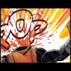
The Welsh Paddy Posted November 8, 2012 Report Share Posted November 8, 2012 Yeah, couldn't think of a better title here...SOTW Entry #1 - Comic ThemeSOTW Entry #2 - Black & Blue Theme (Note that this sig is supposed to be best viewed with 3-D glasses. The ones with the different coloured lenses, not the ones you get in cinema these days.)SOTW Entry #3 - Final Fantasy X-2 ThemeThought I may as well post my SOTW entries here as well so that I can get some feedback on them. I used to do so much graphical stuff, but I haven't been into it for a few years. That Captain America one I made was the first in a very long time. I think I do have a thread here somewhere with loads of my older stuff, so I'll link that here when I get 'round to digging it up. I may have some other old stuff that I've never posted, so I'll eventually get 'round to that too.But in the meantime... Here is the first sig I made for this week's SOTW.I'm not sure whether this is better than the Yuna one, but yeah, I chose the Yuna one as my entry. Have to wait and see if that was a better choice.Anyhow, I'm working on some more stuff as we speak. I was quite happy with my Sonic and Shadow 3-D sig, so that's definitely something I'm going to explore further. So yeah, have at them. Be honest and tell me what you think. What works? What doesn't work? What could I improve on? Link to comment Share on other sites More sharing options...
Breathless Posted November 8, 2012 Report Share Posted November 8, 2012 I really liked your Captain America sotw! One thing I don't like with all your gfx is the text is too strong for my taste. (and un-edited i think). Really makes me cringe a bit haha, but they're all looking good! Keep it up. :] 1 Link to comment Share on other sites More sharing options...
† poetictragedy Posted November 8, 2012 Report Share Posted November 8, 2012 The Cap signature is my favorite of the ones you've posted. I really enjoy all the different panels. There's nothing I'd change about it; I love it the way it is!I can't really comment on the Sonic signature; I don't have 3D glasses, so I feel any criticisms would be moot because I can't see the signature at it's fullest. It's definitely an interesting venture, and one I've never even considered trying; so good on you for that.For the two Final Fantasy ones, the only thing that bothers me would be the text, as Breathless said. I'm all for simple texts; I use them most often. But it seems like the text doesn't fit into the signature, almost like it's pasted on top. Try turning down the opacity of the text layers, and add other blending effects (this is pretty easy to do if you're using Photoshop).I think you've got a really great start, and I hope to see more from you in the future, mister! ;D 1 Link to comment Share on other sites More sharing options...
The Welsh Paddy Posted November 9, 2012 Author Report Share Posted November 9, 2012 Yeah, one thing I've always sucked at was using text. It's something I'm going to work on though. In the meantime, here's a set that I've made for some chap...Didn't do much with the text other than use a layer effect 'Drop Shadow' to add more depth, but overall I'm quite happy. I much prefer working with pop art style images when it comes to stuff like this. Link to comment Share on other sites More sharing options...
† poetictragedy Posted November 9, 2012 Report Share Posted November 9, 2012 Didn't do much with the text other than use a layer effect 'Drop Shadow' to add more depth, but overall I'm quite happy.Even that one change makes a HUGE difference. I guess if I had to choose something to critique, it would be that the text is too large for my tastes; but that's just nit-picking.You're really good at the pop art style, something I'm not completely comfortable with yet. Great job! 1 Link to comment Share on other sites More sharing options...
The Welsh Paddy Posted November 13, 2012 Author Report Share Posted November 13, 2012 Been really busy lately, so I haven't gotten anything new done. However, from digging through the forum, I found this old thread containing much of my older stuff. (From around four years ago!)Old CrapLooking back, I still like some of it, but a lot of it is kinda crap. xDI'm afraid I can't do anything about the dead links there, though. You'll just have to do without seeing a couple of them. Link to comment Share on other sites More sharing options...
The Welsh Paddy Posted December 12, 2012 Author Report Share Posted December 12, 2012 Alright, here's a few new things, some of which hasn't been posted yet, but I thought I'd add in my last few SOTW entries as well for some feedback. Been trying out some different things, so there's quite a variety of stuff here. Link to comment Share on other sites More sharing options...
Breathless Posted December 12, 2012 Report Share Posted December 12, 2012 Out of all those newer ones I really like the catwoman signature and the Rapture one. After those two I probably like Mr Freeze.What CnC to give... I just finished work so my eyes can't focus too well right now. I'll start from the top though.For the Rapture one, I actually really like it- haha! If I had to pick anything out, again it would be the text. It actually does fit the sig rather well (unlike your FF X-2 ones which just stood alone) but maybe you could blend it in a bit more? Or the opposite and pop it out? Also - on the bottom left side of the signature there's an irritating outline on part of the left render. Apart from those two things it's awesome!The avatar is really cool too, I like how you actually added in a light and shadow and placed them accordingly - it gives it a cool 3D effect.Mr.Freeze, pretty cool again. Don't have any real big complaints about the text here. Personally, I don't think you needed the borders on the sides <- ->, just top and bottom. I guess that's just stylistics. the numbers on the right are a little blury, not sure if that was intentional or not but I'm not too keen on that. Apart from that, I'm not sure what I think about it? I mean, overall I do like it but I can't put my finger on why.The Catwoman one is by far my favorite. My eyes are drawn to three things, first, the popped out Cat Woman, second, the Cat Woman inside the signature and third the text! Awesome work, the white outline around the text is basically the only thing I don't like about this signature. Maybe also the colours? (red and yellow)That being said, out of all of your works I still think your Comic SOTW and Taskmaster works are the best. I mean, they're simply amazing! 1 Link to comment Share on other sites More sharing options...
(AC) Posted December 12, 2012 Report Share Posted December 12, 2012 Nice work man. 1 Link to comment Share on other sites More sharing options...
spidey5443 Posted December 12, 2012 Report Share Posted December 12, 2012 (edited) Like breathless said your Taskman and Captain america sigs are your best yet! Might I suggest you try looking at some tutorials?Oh and try not to use low quality renders it doesn't help in your signature outcome.....it sorta makes your sig look low quality Hope, I have helped! I'm not trying to offend you just telling what i think(saying this before someone might think I was being mean) KIU, mate! Edited December 12, 2012 by spidey5443 1 Link to comment Share on other sites More sharing options...
The Welsh Paddy Posted December 12, 2012 Author Report Share Posted December 12, 2012 Thanks for the criticism guys. I can't imagine myself going back to fix any of these. (Well, the Rapture one was made as a request, so we'll wait and see if they want anything changed for it.) But when I next start on working on some newer stuff, I'll definitely keep much of this in mind. Link to comment Share on other sites More sharing options...
The Welsh Paddy Posted December 13, 2012 Author Report Share Posted December 13, 2012 (edited) Alright, so here's something completely different. CD Cover Art!So, THIS is the original image that I used. With some (rather simple, actually) manipulation, I proceeded to make this...Cover FrontI also made the back, too. For that, all I did was set a gradient background and apply the same effects that I used on the front image. I also used a render of a disco ball that I found on psdgraphics, and then of course, added some text.Cover BackNot that this is not for any actual album or anything like that. I just thought this was a fun concept to muck around with. Edited December 13, 2012 by The Welsh Paddy Link to comment Share on other sites More sharing options...
† Emotional Outlet Posted December 13, 2012 Report Share Posted December 13, 2012 It's a fun concept, maybe a little cheesy, haha. I like the limited palette and the echoed silhouette--it has that kind of old school retro feel to it, which seems to be what you were aiming for. The graininess around the echo is actually pretty cool and adds to the retro feel, but maybe make it a different colour? Red on a slightly different red is a little uncomfortable.It feels like you're mixing genres--the front and back don't really seem to go together despite being tied together with the dots. It might look better if the back was flipped, so it'd look like a continuation across the spine instead of across where you'd open the case?? Composition is hard for me, haha. The text cutting off at the edges is sort of distracting, but that seems like something you didn't have much control over. You could probably use a different text for the tracklist itself--especially since it's a lot of text, a simpler font would be easier on the eyes.It's pretty cool though! If it was something I saw while browsing, like, Jamendo or something, I'd click it to see what was going on in it. 1 Link to comment Share on other sites More sharing options...
The Welsh Paddy Posted December 13, 2012 Author Report Share Posted December 13, 2012 Yeah, I kinda wanted to go for the sort of look you get from old funk and rock records. Thanks for pointing out the issue with the text, I didn't actually notice it was cut off slightly until you mentioned it haha. I can fix that up easilly enough, though, and I do think the text for the tracklist is a bit much. Kinda focused more on it being consistent as opposed to readable. Making the back look more like it's following on from the front is something I will also do. As for the slightly different red on the echoed area... I can't see it. x_x; Probably down to screen resolution. I'll fiddle with the resolution on this, but I'm certain it's as high as I'm gonna get it, so I probably won't be able to fix that unless I can mess around with the image on a better monitor. Link to comment Share on other sites More sharing options...
Alice Posted December 13, 2012 Report Share Posted December 13, 2012 EO may have gotten it finished first, but that is okay. OKie dokie...peeps have already given their opinions about your other works. And for the most part I agree with them. Now to tell what I think about the CD covers you posted...where to start? Hm...I like the back way better than the front. The colors don't match or something. The front is a more in-your-face brightness and hurts my eyes, while the back is more orangy and a bit duller. If you look at them side by side...you'll understand:I do like the dot thing you got going on, but as I said earlier, the back one is way better even in that area. I love how you did the disco ball. The front is done way too sharp...I think it should be done smoother and the outer outline popped-out from the original image seems a little too far...also seems too sharp. I don't mind sharp but when it goes too sharp it bothers the eyes. I think you would have been good to do the image on the front similar to the disco ball image. Not sure how you would go about doing that but it would work for it. Basically the front cover would look better if it had been done like the back cover.Now onto what was already been pointed out as your kryptonite -text. Normally, I really love the use of interesting fonts. I have so many fonts on my computer it is ridiculous...but when it comes to CD covers...I prefer seeing those that are simpler fonts that are easy to read. The fonts you used you used are not so easy to read. The only font I like and is easy to read for me is the one for "Gettin' Junked Up". Also the fonts don't look smooth...instead, like the image thing...too sharp.These are just my opinion...and honestly the most I have ever criticized anything. Take it however you wish. 1 Link to comment Share on other sites More sharing options...
The Welsh Paddy Posted December 13, 2012 Author Report Share Posted December 13, 2012 Yeah, turns out the color difference is down to the fact that I used a gradient for the back section. I should probably try doing that for the front as well, might make it look a bit softer. I also upped the contrast quite a lot, which would account for it looking incredibly sharp. Well, as stated, this was more for the sake of just trying out something different. And text... No matter how much I try out different fonts and positioning, it's always hit or miss for me... but mostly miss!I appreciate the criticism from you guys. For once, I'll actually apply this to improve this cd cover. Usually criticism is something I keep in mind for future works, but I'm kinda attached to this, so I'm gonna go work on it some more when I got a bit of spare time. Cheers! 1 Link to comment Share on other sites More sharing options...
Alice Posted December 13, 2012 Report Share Posted December 13, 2012 (edited) This is just an offer...but if you can post the image after you've worked on it. I can possibly help you with the text problem and then re-post them for you to save on your computer. Just an offer, as I said.ANyways, good luck with your editing. Edited December 13, 2012 by Dreamcastor 1 Link to comment Share on other sites More sharing options...
The Welsh Paddy Posted December 13, 2012 Author Report Share Posted December 13, 2012 I may hold you to that! I'd probably benefit from being taught a bit more when it comes to using text in graphics. 1 Link to comment Share on other sites More sharing options...
† Emotional Outlet Posted December 13, 2012 Report Share Posted December 13, 2012 It might just be my eyeballs playing tricks on me, haha, and the quality of the echo. Either way I think it'd look better if it was a different colour. Link to comment Share on other sites More sharing options...
playlamegetfame Posted December 14, 2012 Report Share Posted December 14, 2012 It might just be my eyeballs playing tricks on me, haha, and the quality of the echo. Either way I think it'd look better if it was a different colour.A diffrent color woundnt cange anything... but lesser saturaition would and that outline should get more contrast to the bg. 2 Link to comment Share on other sites More sharing options...

Recommended Posts
Please sign in to comment
You will be able to leave a comment after signing in
Sign In Now