Alice Posted December 14, 2012 Report Share Posted December 14, 2012 As PLGF said, the color won't change anything. The color isn't the problem. I didn't think of changing the saturation...hmmm....that does sound like it would work. Link to comment Share on other sites More sharing options...
The Welsh Paddy Posted January 10, 2013 Author Report Share Posted January 10, 2013 I actually lost the .psd for that CD cover. But I have since moved on anyways, and went and got myself Photoshop... finally! So I've gone and come up with a huge batch of new stuff, which I hope you all like! Again, feedback is always good to have! Random GraphicsBatman GraphicCatwoman GraphicScarecrow Graphic 1Scarecrow Graphic 2KJB Cast LogoB-Movie PosterCookies & MilkSigs and AvasZelda Sig 1Zelda Sig 2Zelda Sig 330 Days of NightYuna SigYuna AvaMickey Mouse SigBootsy Collins SigAnd, I also made my current sig and ava set! Again, feedback is always appreciated. 1 Link to comment Share on other sites More sharing options...
Dark_Angel13 Posted January 10, 2013 Report Share Posted January 10, 2013 Not a bad set of pics, I looked at them all. The batman one was quite good, the others I wasn't such a fan of actually. So far the work seems solid so good work 1 Link to comment Share on other sites More sharing options...
Breathless Posted January 10, 2013 Report Share Posted January 10, 2013 Congrats on getting Photoshop!I really like your Scarecrow works, especially the second. I also like your second Zelda sig and the 30Days of Night. Oh, and your sig&ava set too!These.Your works always feel so retro to me, like pop-art or something like that? Maybe that's the wrong way to put it, but they're different in a good way. I don't know how to explain it.You're really good at the chaotic kind of splash art-ish look and the comic/pop-out style.By the way, can I ask how you got the outline shape for the Scarecrow graphics? Whenever I try to make a transparent background like that it ends horridly. 1 Link to comment Share on other sites More sharing options...
The Welsh Paddy Posted January 10, 2013 Author Report Share Posted January 10, 2013 (edited) I always start the graphic on the second layer. It's easier then to use the first layer for trying out different background colours to see how well it looks against different colours. When I'm done, I just delete the background layer, merge VISIBLE layers (Don't flatten image) and then save it as a .png. I'm not sure what program you're using, but basically if you use the second layer to place the shape that you want the piece, then you should be able to delete the background layer then to make it transparent. Haha, that second Scarecrow piece was a bleedin' nightmare to get right. The render wasn't the best of qualities, plus I had to erase a lot of it and re-draw some of it to try and make it look like he was stepping out of a portal or something. It's a very simple looking piece, but believe me it was bloody awkward! Edited January 10, 2013 by The Welsh Paddy Link to comment Share on other sites More sharing options...
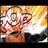
The Welsh Paddy Posted January 11, 2013 Author Report Share Posted January 11, 2013 Another sig and ava set... 1 Link to comment Share on other sites More sharing options...
Alice Posted January 11, 2013 Report Share Posted January 11, 2013 Out of all of them these were the only ones I liked. They were you're best. It looks like you really took time on these to make them fit properly. Keep up the good work. 1 Link to comment Share on other sites More sharing options...
† poetictragedy Posted January 11, 2013 Report Share Posted January 11, 2013 I like the ones Dreamcastor mentioned best as well. In the green Link signature, the text is a little difficult to read, but that's really the only major flaw. I love the effects used in the Yuna and Mickey signatures.Some of your other works seem too busy. Take the green Scarecrow graphic for example. While patterns can make the signature more interesting, it's my belief that they should be relatively subtle. I don't really know how to explain it, but it's like the eye has a hard time focusing on the render because there's so much other stuff to draw it away. I do love the font you used for that one though.Sorry, if this isn't very helpful. I don't know how to words and it's 2am, so I should be asleep. @_@ Keep practicing! You'll only improve more. =) 1 Link to comment Share on other sites More sharing options...

Recommended Posts
Please sign in to comment
You will be able to leave a comment after signing in
Sign In Now